A Soft Ceremony & Bold Reception at Westwood Country Club
This month, we’re revisiting the gorgeous wedding of Aubrey and Nick! Aubrey, a graphic designer, had a strong vision for her special day that included some of her own design work, plus contrasting aesthetics for each venue. While some couples want a similar feel at both their ceremony and reception, we think this wedding is a great reminder that it’s okay to mix styles from venue to venue. Keep your guests guessing by creating differing moods for each location while using small details to tie everything together into a cohesive look.
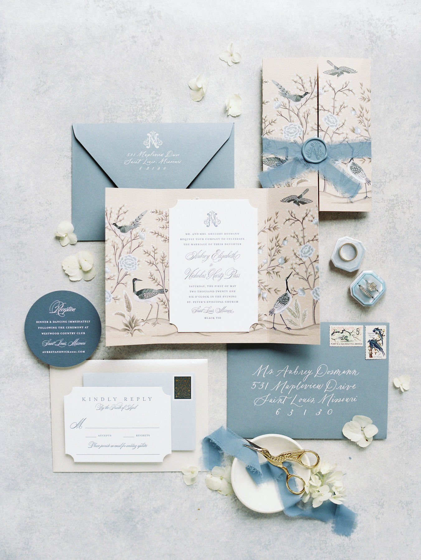
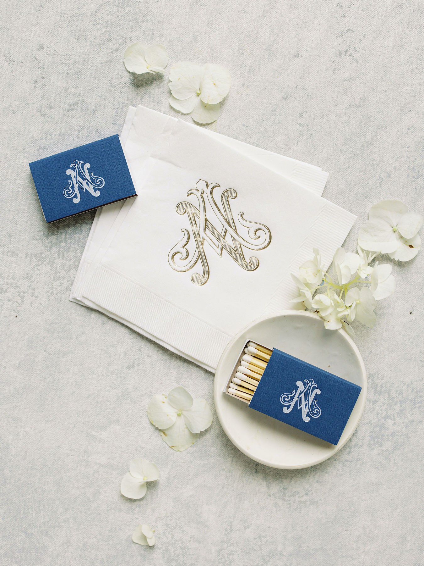
It’s always fun to see the ways in which our clients use their creative talents to add their own flair to a celebration - plus, collaboration with our clients is always a pleasure! For this event, Aubrey personally designed several bespoke, chinoiserie-inspired elements for the day, which included these breathtaking invitations and monograms featuring bird motifs and shades of blue.
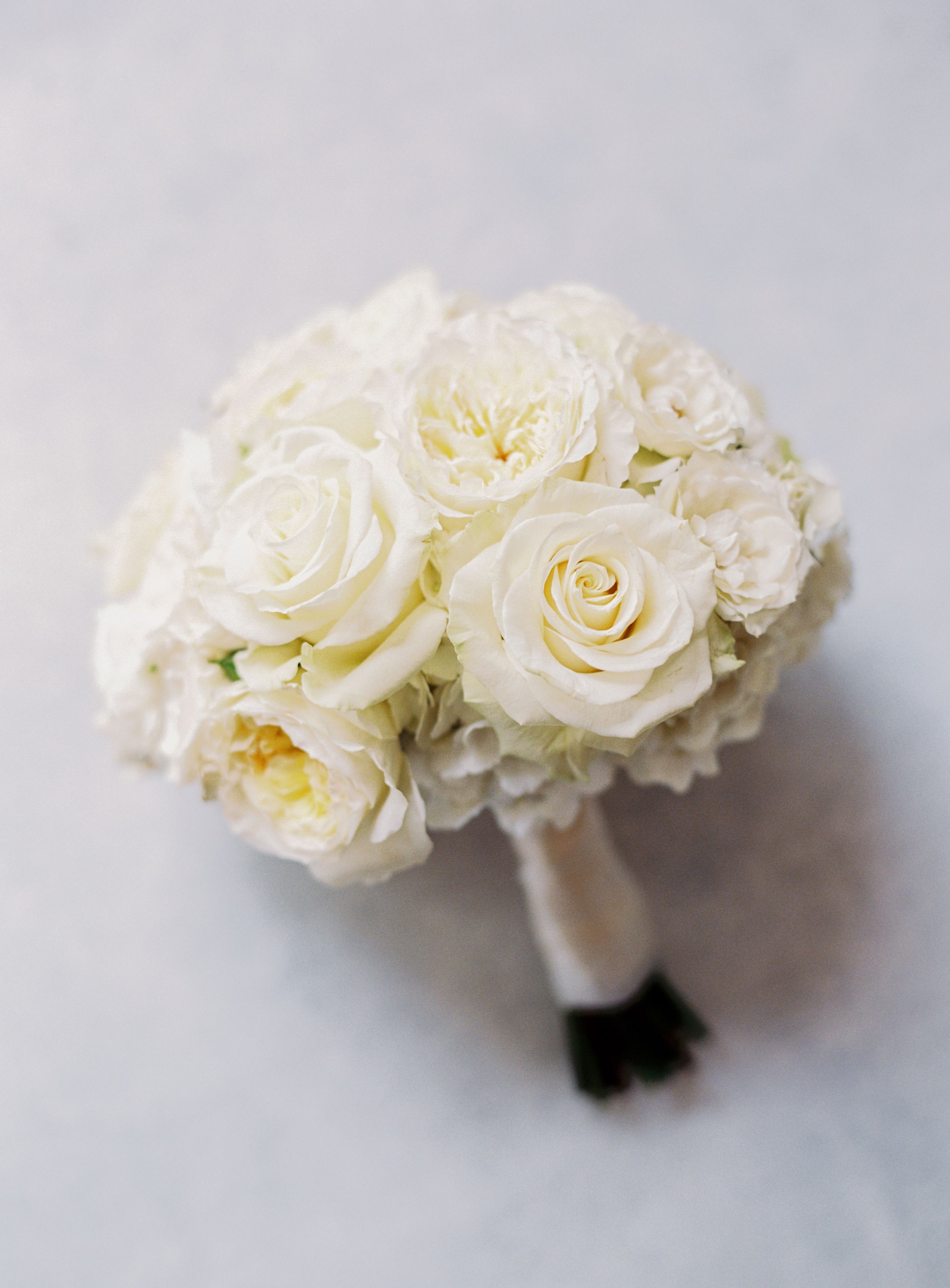
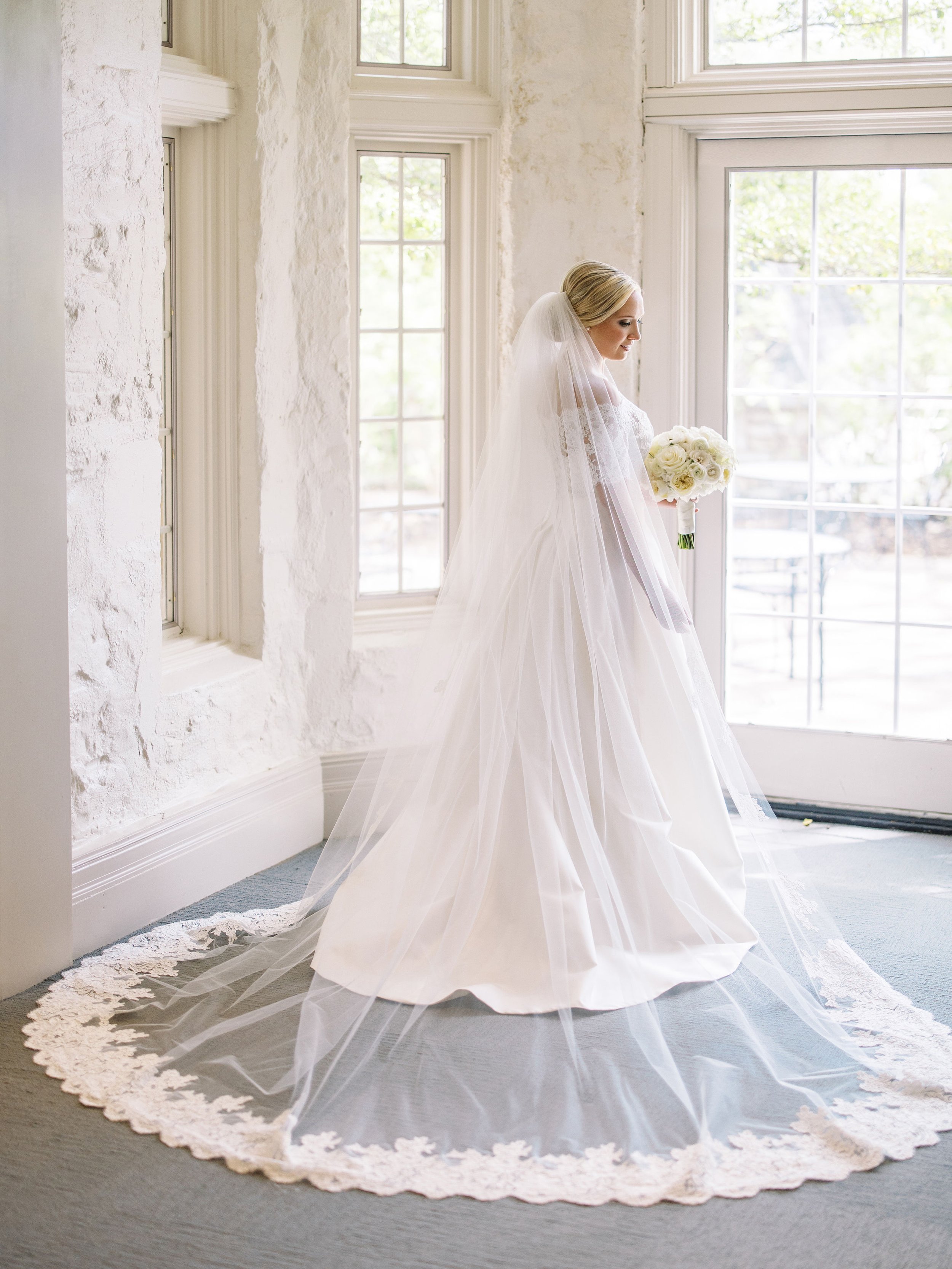
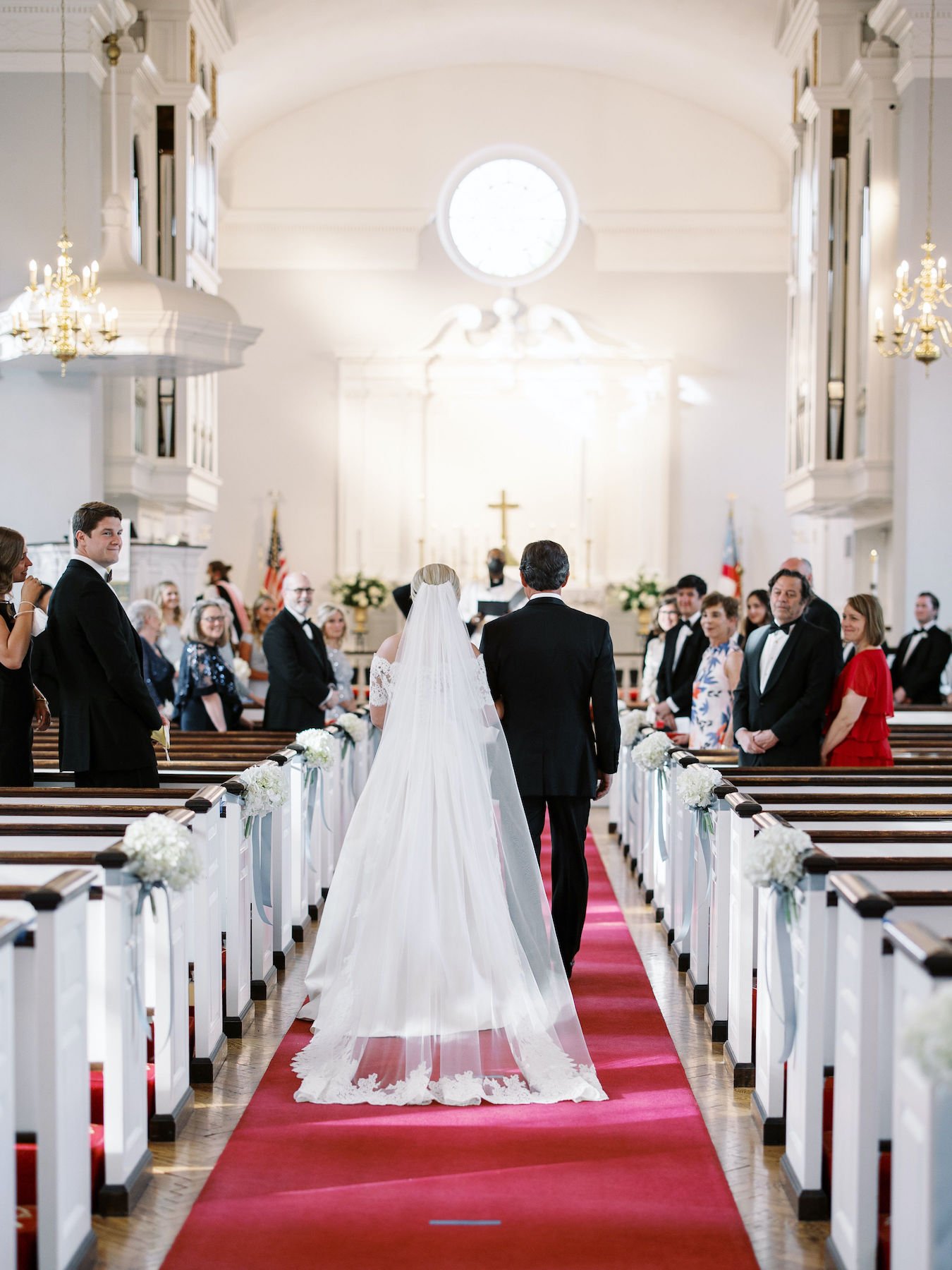
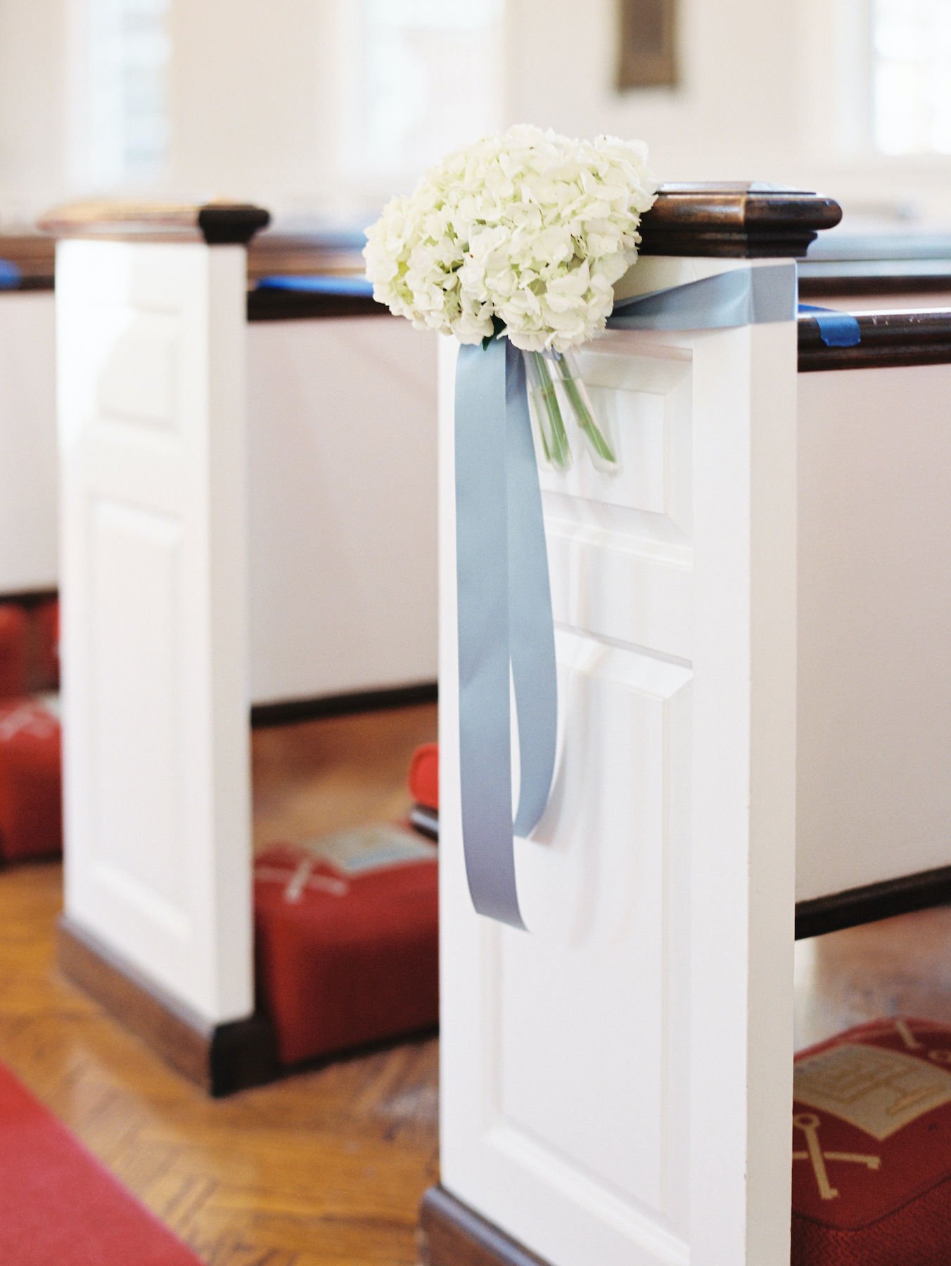
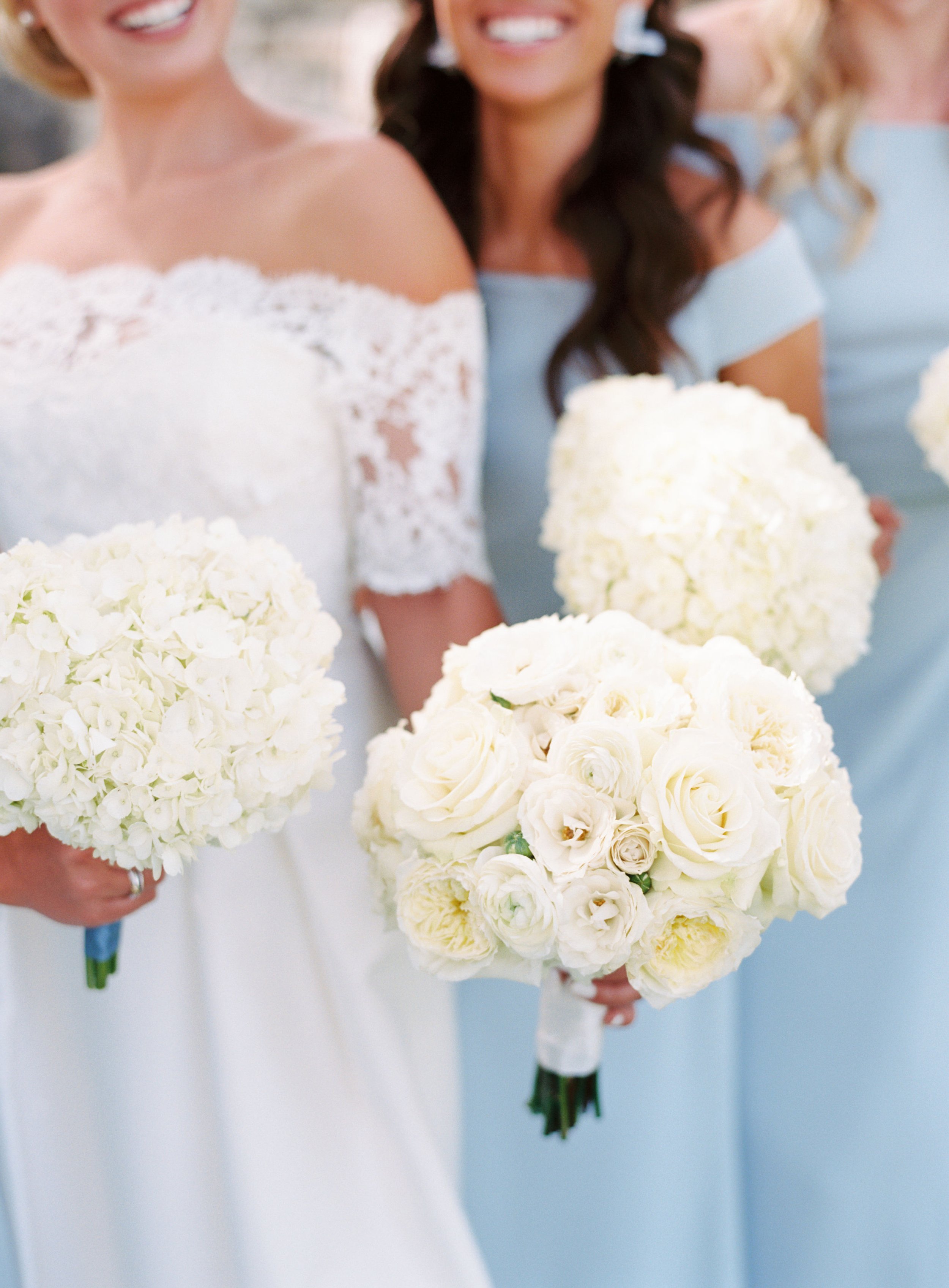
For the ceremony, the couple opted for an airy, romantic feel with monochromatic white florals and signature dusty blue details. We love the way Aubrey’s classic bouquet of roses and peonies pairs with the exquisite lace detailing of her gown. Can we take a moment to drink in the beauty of this veil with our eyes? Absolutely STUNNING!
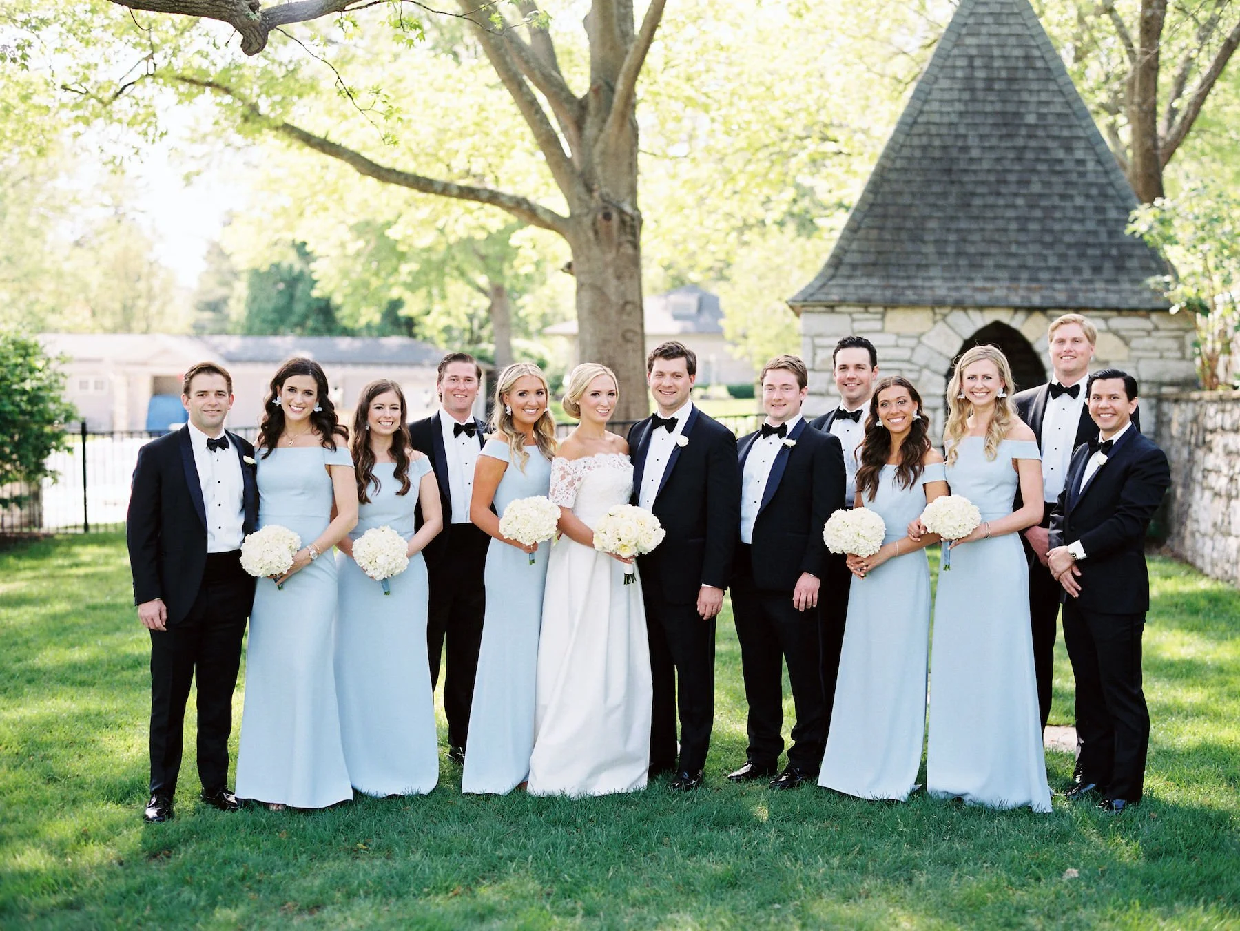
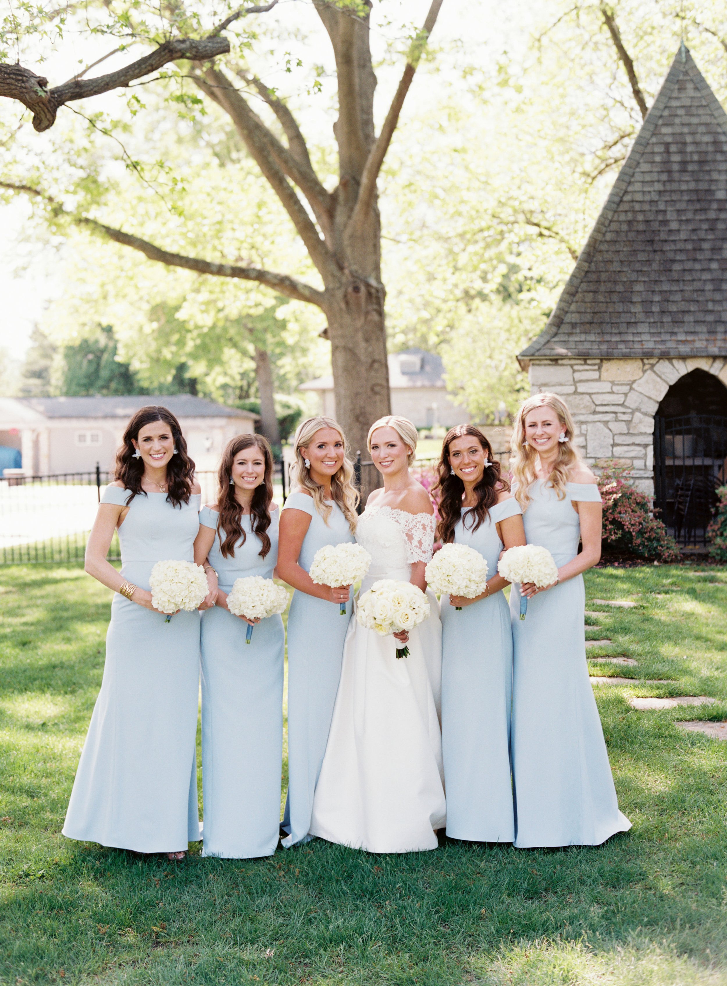
For the wedding party, simple white hydrangea bouquets paired perfectly with the bridesmaid’s robin-egg-blue gowns. A white and ivory color scheme, along with a classic rounded bouquet style, makes for a timeless look that photographs beautifully!
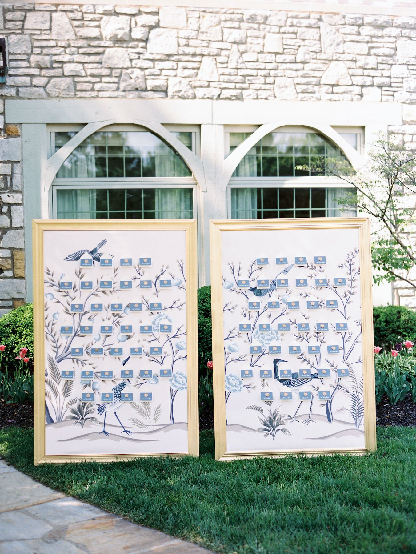
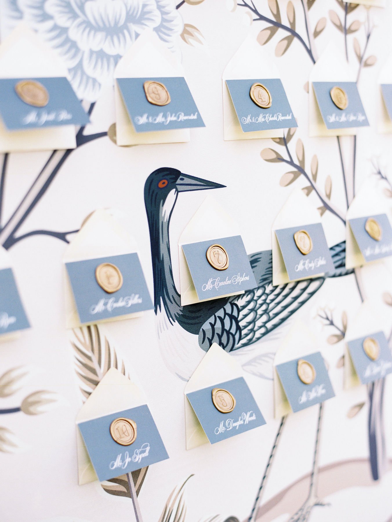
Back at Westwood Country Club for the reception, guests were greeted with this incredible escort card wall. The framed fabric, designed by the bride and custom printed, had our team swooning! While Aubrey provided the material, our illustrious leader, Lisa, took it upon herself to make sure the fabric was framed to perfection. Check out those hand-stamped wax seals on each card - another small detail that makes a huge impact!
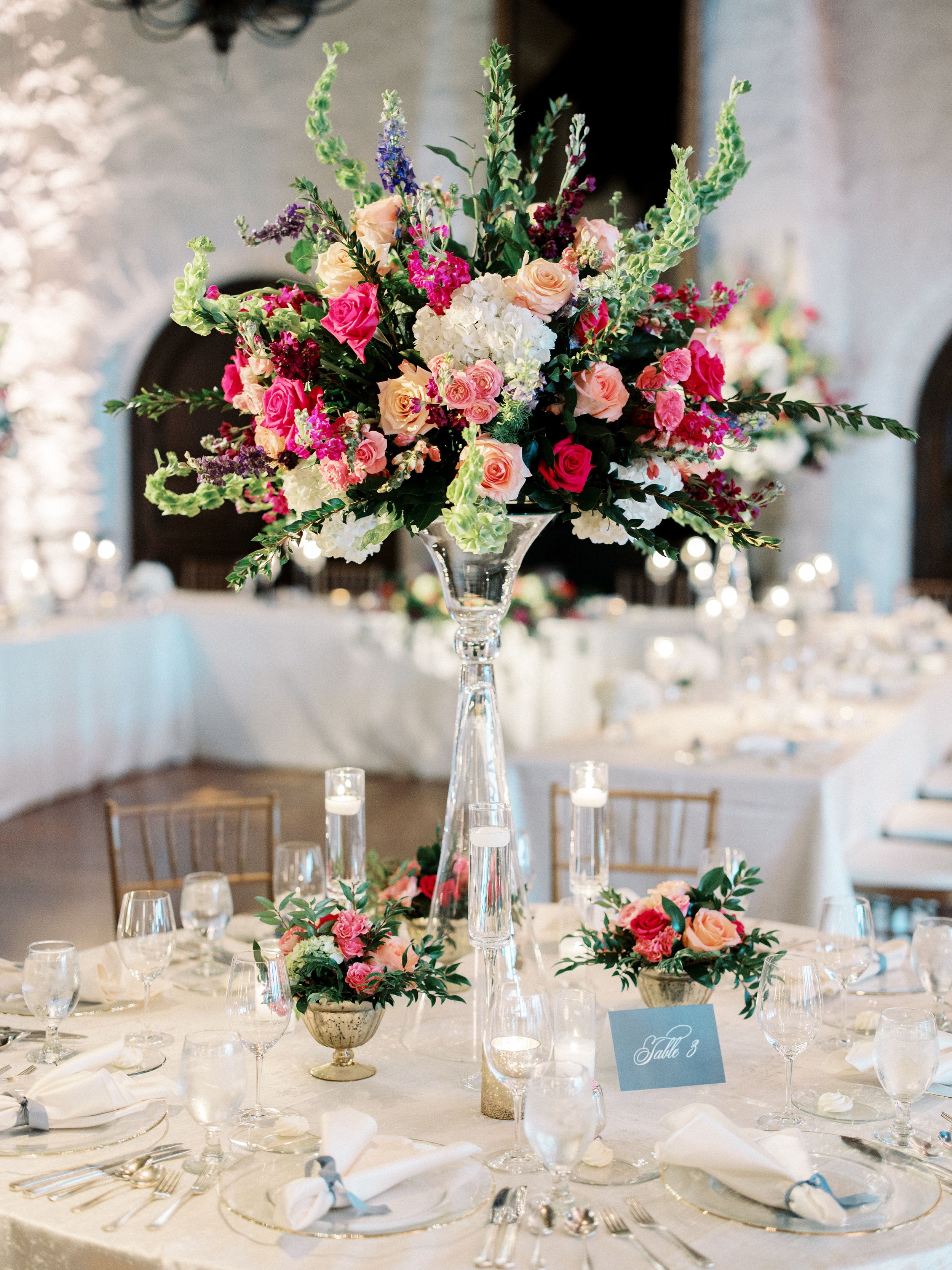
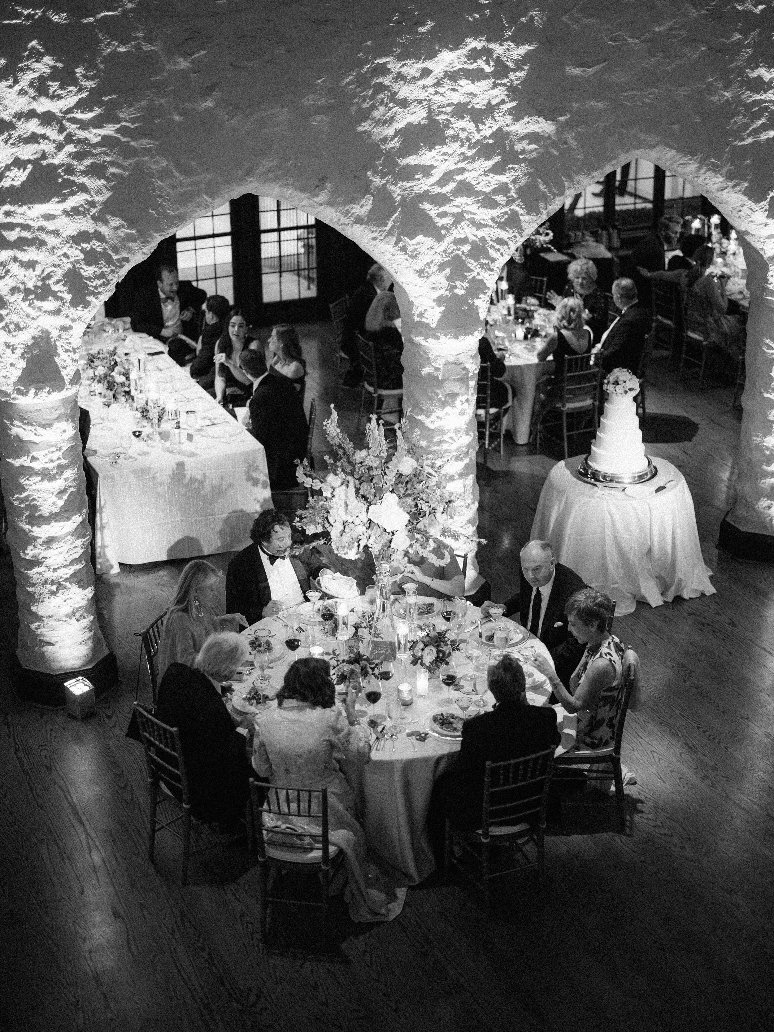
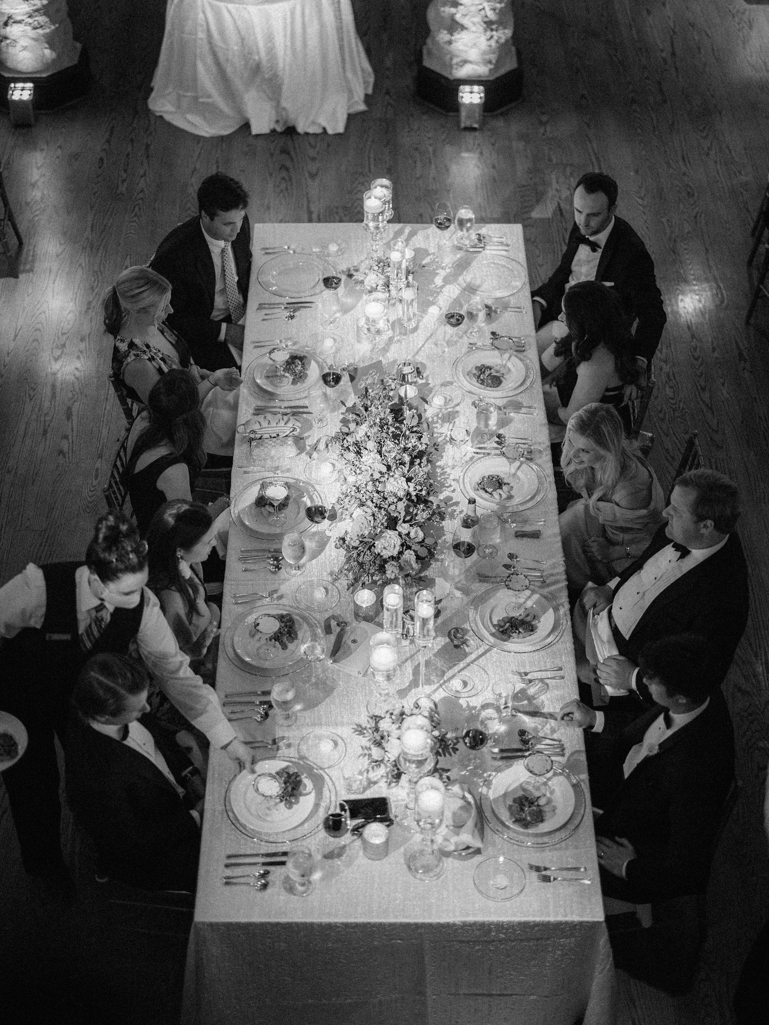
While the ceremony was soft and romantic, the reception’s vibe was “Time to party!” To get guests in the spirit, our design team used bold colors that popped against the white interiors of the venue. Pastels are definitely trending right now, so we appreciated the opportunity to design with a bright palette. We especially enjoyed working with Bells of Ireland - the green color and whimsical shape added an eye-catching and fun element to the tall arrangements. To tie the ceremony and reception together, details such as table cards and napkin ties incorporated the same blue from the invitations and ceremony pew decor.
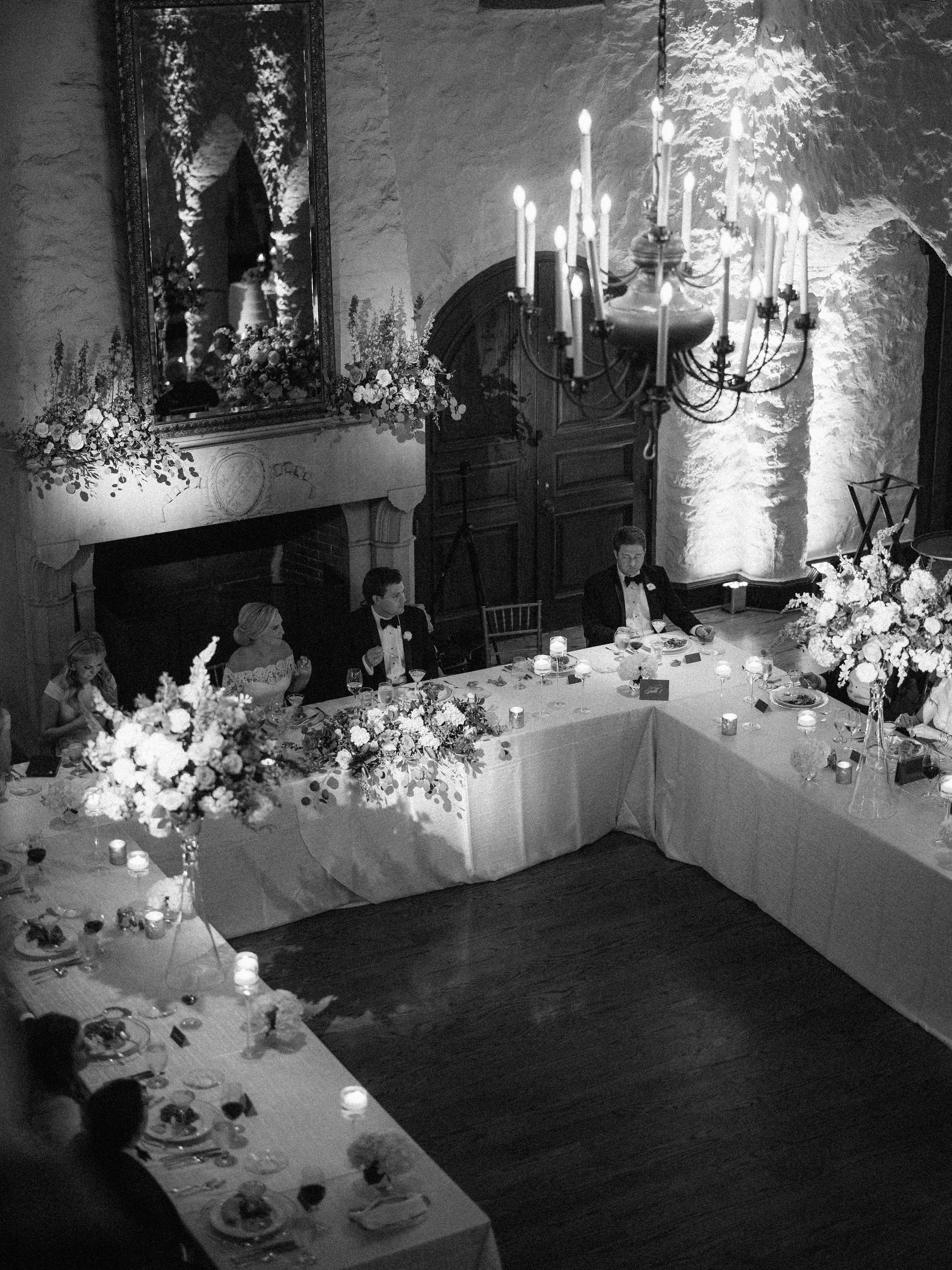
Looking for a different layout for your reception than the usual? Take inspiration from Aubrey and Nick, who chose a U-shaped “family table,” rather than the traditional head table with the wedding party only. The guest tables were highlighted by a variety of centerpiece styles, including long-and-low and tall arrangements which were accompanied by smaller florals and candles.
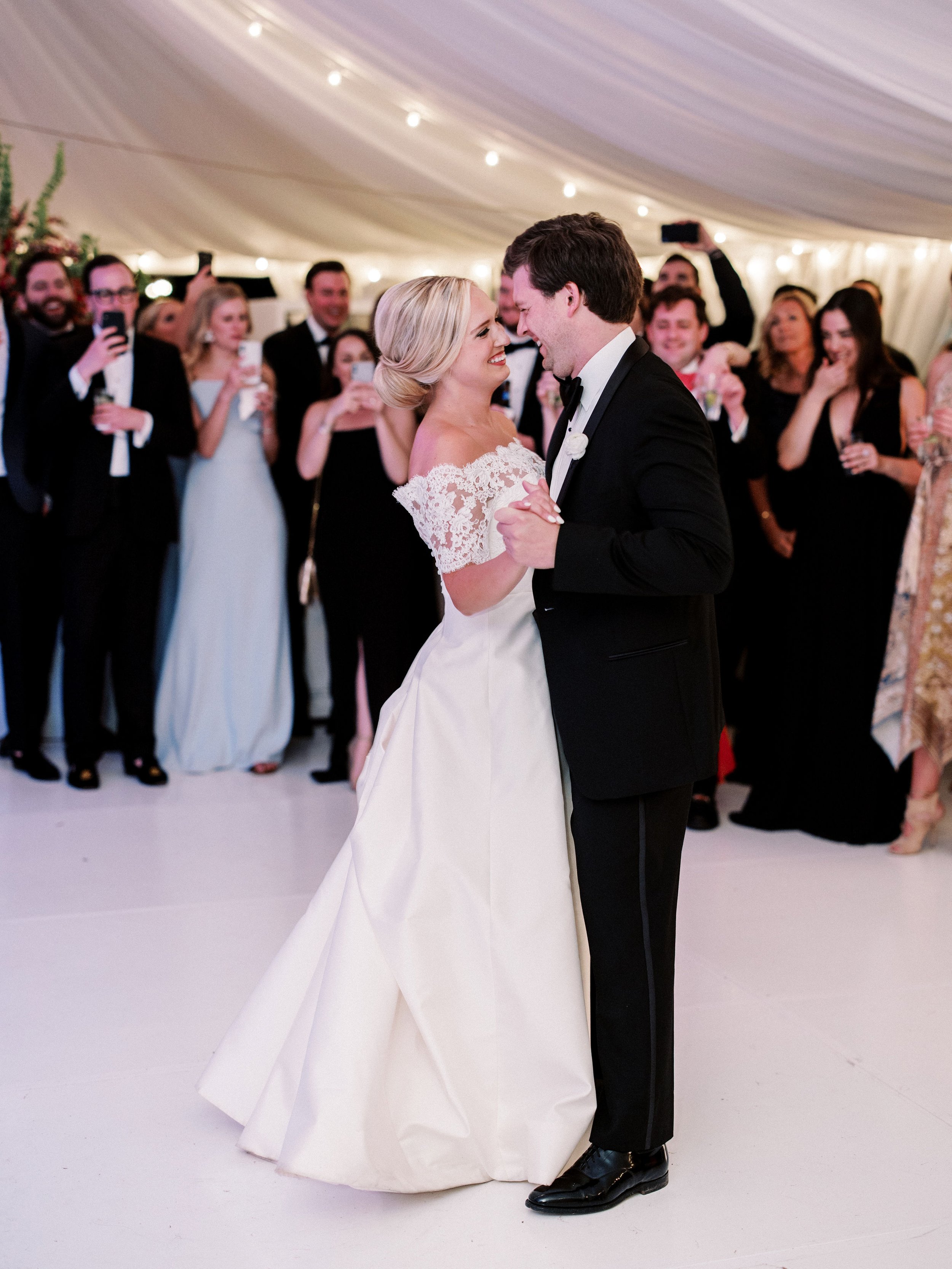
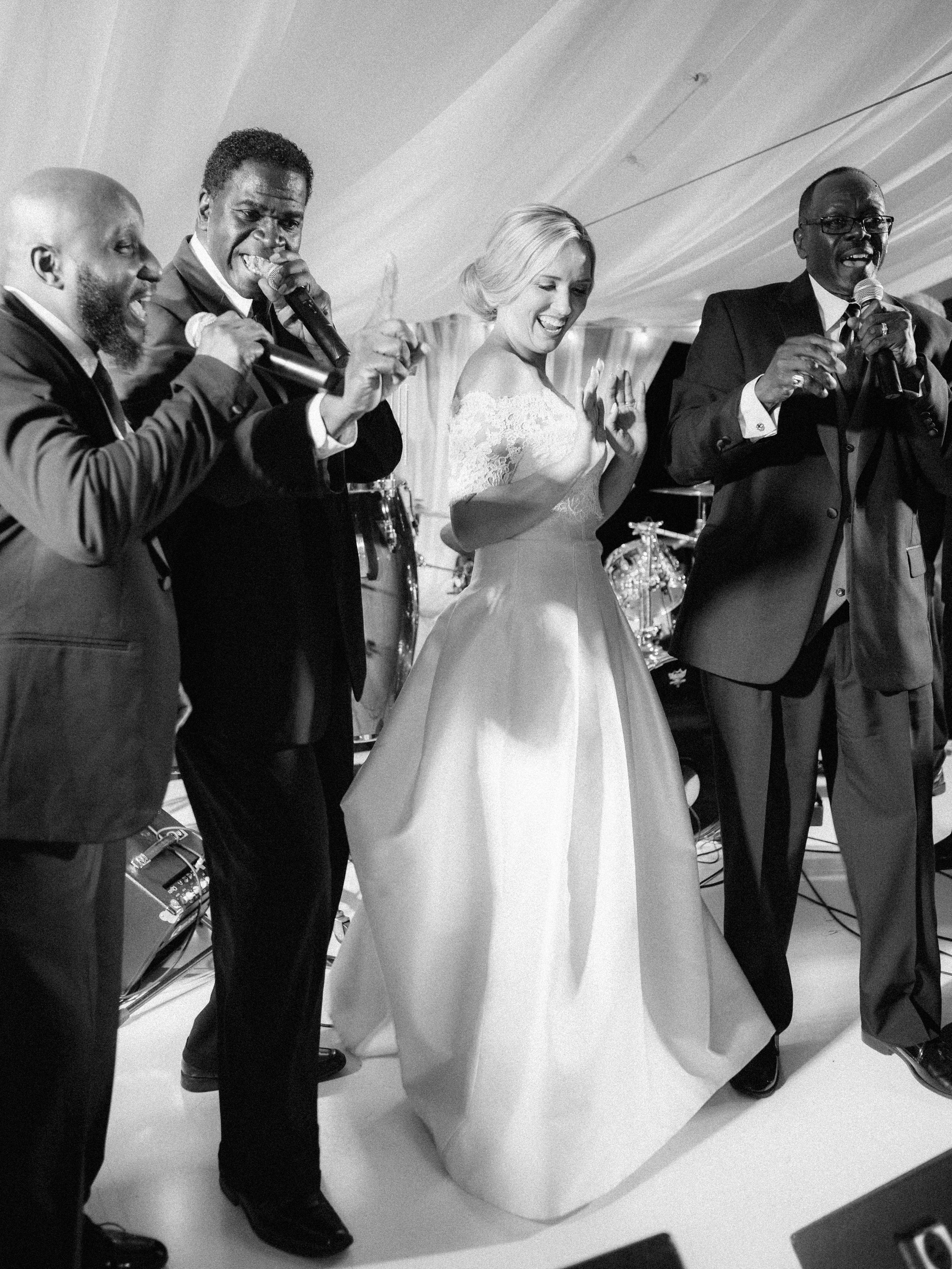
In a tent outside, guests danced the night away with the musical stylings of The Fabulous Motown Revue. A soft, draped ceiling and additional lighting created the perfect ambiance to let loose and boogie. Honestly, this event looks so fun we wish were there!
Congratulations to Aubrey and Nick and thank you again for letting us be a part of your big day!
Vendor Love
Photography: Mike Cassimatis | Planning: Simcha’s Events (Kristin Byars) | Ceremony Venue: St. Peter’s Episcopal | Reception Venue: Westwood Country Club | Hair & Makeup: Emily Miller Team | Cake: The Cakery | Stationery: Le Clé Studio (Bride’s Company) | Band: The Fabulous Motown Revue
